Digital Scrapbooking Graduation Series
Part III
As with the other two layouts, I have decided to do another simple digital scrapbooking design. This is a continuation of the series I have been working on since last month.
Why Purchase Elements?
If you are not comfortable designing your own elements for digital scrapbooking, there are many, many web sites that you can visit to not only find inspiration; but to also purchase kits for making many different scrapbook pages with a similar look and feel.
All of the pages in this series include the same colors and similar design elements to give more continuity. It does help that these are some of my favorite colors!
Don’t be afraid to purchase kits online. They are great for quick projects or even getting you through that design block that so many of us can experience. It is like writer’s block, but with graphics. There is nothing wrong with using these purchased kits; just make sure you give credit where credit is due.
The Design of This Page
While I purchased this as a kit, it can still take time in deciding which colors to put together, which papers do I want to use or even if a certain background fits with the pictures. When I first started this particular page I chose a background that was so busy, as soon as I placed the pictures on top I deleted said background. It was awful!
This one is a little busy, but I think that by using the solid color papers behind the pictures, it allows the eyes and brain to break up the images and not see them as clashing. Play around with your images. Sometimes what you think will work, just won’t and you need to try again.
I may not have produced the graphic images used as elements on this page, but I still had to design the final product. I started with the background paper, after first selecting the pictures I wanted to use. I then realized I needed something more and picked the blue paper to place behind the pictures to break up the geometric design of the background paper.
I added the cute buttons and chose a cutesy font for Celebrating You and a simple font for June 2007. I am still not sure if I like the simple font with the cutesy font, but I am leaving it as is; so you too can see; sometimes it is difficult to decide which font to use.
All images have a simple shadow added and that is accomplished by using Layers>Blending Options>Drop Shadow.
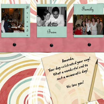
I have added an additional layout page so that you can see a page that isn’t just simple. The layout consists of three photos and I incorporated more elements and little more journaling.
Papers/Embellishments by Alison Folendore
Layout Design by Laura Costello
Laura's Blog
Return from Digital Scrapbooking Graduation Series to the Home Page


