|
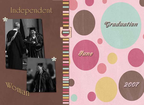
Using a Digital Scrapbooking KitBecause of the busy holiday season, I have decided to use some digital scrapbooking kits purchased online to make the latest layout. I normally make the elements or embellishments myself; but as I said, the holiday season kind of puts a damper on my creative side. 
As you can see, this particular digital scrapbooking kit is quite colorful. Even though these elements were made by someone else (Alison Folendore); you still need to be able to see the ‘big picture’ and put it all together in such a fashion that it flows. If you are ever in need of inspiration, just take a look at a magazine. There are so many advertisements that would make excellent scrapbook pages; whether digital scrapbooking or paper scrapbooking. There are times you are going to want to make a ‘series’ of layouts, which is great. Because there are are normally so many pictures, scrapbooking special events is a great place to get started. If you have some pictures you would like to put in a digital scrapbooking series, let’s scrap together. You can follow along and we can have lots of fun! So we start with the pictures. At first I picked three, but the third one; when added with the others just didn’t give the aesthetic appeal I wanted, so I removed it about three-quarters of the way through the process. Open Adobe Photoshop I then took the circle paper and overlapped the pinkish paper by approximately three-quarters. So, you should have approximately one-quarter of the pinkish paper showing and three-quarters of the circle paper showing. Where the two papers overlap (a seam), I placed a ribbon. I wanted to add depth to the ribbon and give it a more realistic appearance. To do this I added a drop shadow (from the blending options window) and adjusted the shadow effect to my liking. Next, I started playing with the placement of the photos. I do not always know (honestly, rarely) where I want to place the photos, so I keep moving them around until I get the desired effect. Once the pictures where arranged the way I wanted, I decided to add a bit more ‘oomf’ to them and used Edit>Transform>Skew. Using the Blending Options window; added a drop shadow and a stroke (colored edge like a frame) to each photo. The easiest ways is to add all options to one photo, then right click on the layer in your layer menu and choose ‘copy layer style’. Once you have copied the layer style, right click on the other picture (layer menu) and use the ‘paste layer style’ option. Now both have the same layer style and this process has saved you quite a few steps. Now that we have the digital scrapbooking background papers in place along with the photos and a ribbon that separates the two sides and gives a more finished look, we can start adding some extras. I decided to add a couple of tacks to the pictures, a buckle to the ribbon and some ‘fancy’ font. In order to get the affect that I have achieved with the buckle; just copy/paste the image onto your document (this is a new layer) and make sure that the buckle layer is above the ribbon layer. Now, all you need to do is take the selection tool (square) and draw a square/rectangle the same width as the ribbon, but pull it just past the outside and inside edges of the buckle. Once you have this selected, cut the image. You need to make sure you are still on the buckle layer or you may be cutting a layer you do not want to cut. When performing this selection, it will be easier if you zoom in on the buckle. If for some reason you make the selection to big and you end up seeing the background paper (you do not want to see the background paper)after cutting; then just use the Undo tool and try again, making the selection slightly smaller. By now you want to make sure you have saved your document, if you have not done so already. For the tacks I added to the pictures, well, that was just a simple copy/paste and then using the Free Transform tool to change the size. The font is something I find fun and challenging at the same time. I want a cool font, but one that ‘works’ with the layout. If you plan on using any of the blending options, you want to make sure the font will not become too pixilated (fuzzy). Some fonts just do not look good when you start using the blending options. For this layout, I decided I wanted to keep it simple as the background was pretty busy. I chose the ‘Milano LET’ font and then I made some decorative additions via the blending options tools for the right side of the layout. For the left side of the layout I used the ‘University Roman LET’ font. Earlier I downloaded some free fonts I will be using on future layouts. You can find some really interesting fonts on the internet for free. All you need to do is ‘search’. I will be continuing this series, which will include all the photos I took the day of my daughter’s graduation. The next layout will include elements from the same digital scrapbooking kit to give the series a more uniformed look; but the layout will be completely different. I look forward to showing you some more ways to enhance your treasured photos. Click below to see the continuation of the Graduation Series: Digital Scrapbooking Graduation Series Part II Papers/Embellishments by Alison Folendore
|


